
This is the final color scheme on the Blade Saints chapter. As I mentioned in my first post, they are a Dark Angels successor chapter and, being that, I wanted them to line up more closely with the pre-heresy all black armor rather than the green of post heresy Dark Angels.


This is actually my second pass at this color scheme. In fact, I was almost done (80%) through a 1500pt army before I made the hard decision to change it. In the end it was because I was satisfied but not 100% happy with my first cut. Below is an example of the first scheme.


My method of painting is all about multiple washes and I had original used Badab Black to work up the shadows and in the end I felt it made them a little too muddy. Let me explain… Most shadows are never completely made up of blacks and grays, it contains tints and hints of the color that the object actually is. That being said, what color are the shadows and highlights on black objects? Well I don’t know the scientific color theory answer to that (so you science and art majors leave me alone :) but for my tastes, it depends on whether you’re trying for warm or cold feel to the piece. In the end I found a shade of wash that pleased me and gave me the results I wanted and not just making the model darker. That blend ended up being a 3:1 mix of Thraka Green and Leviathan Purple. And that’s how black armor ended up looking like it’s built up with highlighted blue rather than gray. The next pic just shows the 2 side-by-side.

So I’m moving forward with re-painting my Blade Saints army, wish me luck.
Keep coming by to see if I end up changing my mind again in the late period of getting it done. I already have a bad feeling about this… I used to tinker with airbrush art in high school and the citadel spray gun is giving me bad ideas. But maybe I’ll be able to control my compulsions until I’m working on my son’s Fallen army. Thanks for looking in. Come back soon for a more detailed outline of my “cheater” way of painting armor.


5 comments:
Your new wash REALLY makes a difference! I love how the new-wash-version really POPS! Very good job and excellent demonstration of how just a little variation in how you get from shadow to highlight can make a big difference!
I'm with Joe, the new wash makes the difference. The side by side shot makes a great comparison.
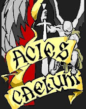
That wash you've used for the newer scheme is great, a definite improvement on that original scheme there. I really like your new Chapter icon too.
I'm completely in awe of your painting my Ultramarines have never really looked anything special (I was thinking about changing chapter but i can't afford to buy the paints at the minute with my eldar project coming up) must have been a lot of work but it was worth painting them again that color scheme looks great!
Wow Peter, thanks for that! I don't see my painting as anything above quality. Don't get me wrong; I'm very satisfied with my choices and the overall results I'm getting but I'm aiming for (and think I'm hitting) a relatively standard tabletop quality. and Thanks everyone for the kind encouragement!
Post a Comment